Give different content a clear place.
A corporate introduction, a transport project and a public notice serve different purposes. They need distinct entry points without making the website feel fragmented.
Making urban mobility information easier to explore—through a website that connects the organization, its projects and the people it serves.
↓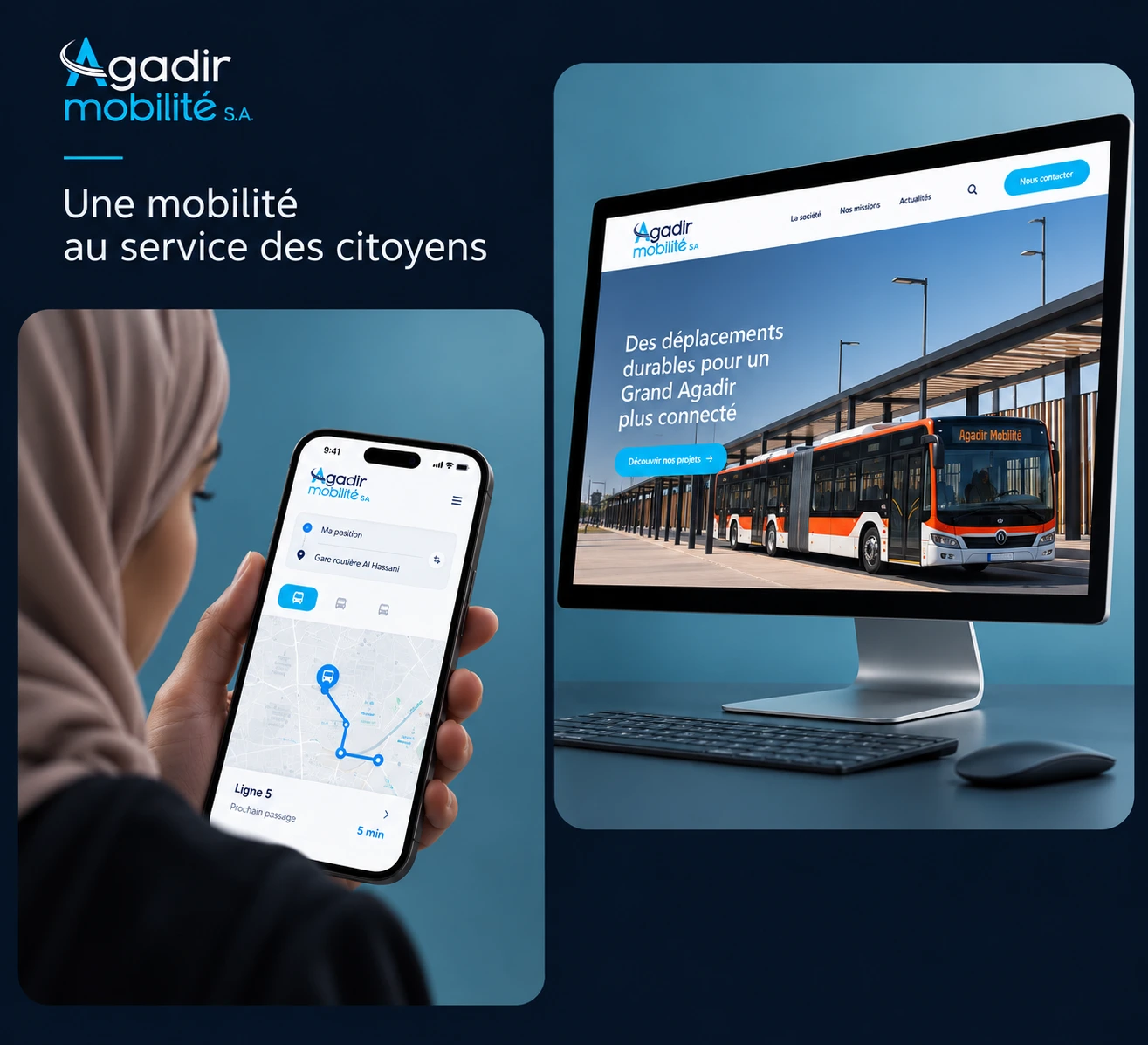
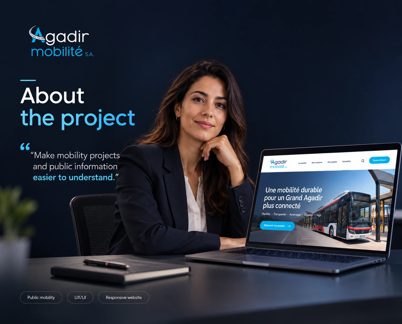
Agadir Mobilité’s digital presence brings together company information, urban mobility projects, public announcements and practical contact details. The design needs to give these different types of content a coherent home.
My focus was the website’s UI/UX: establishing a clear hierarchy, shaping the page layouts and creating a consistent visual language across the experience.
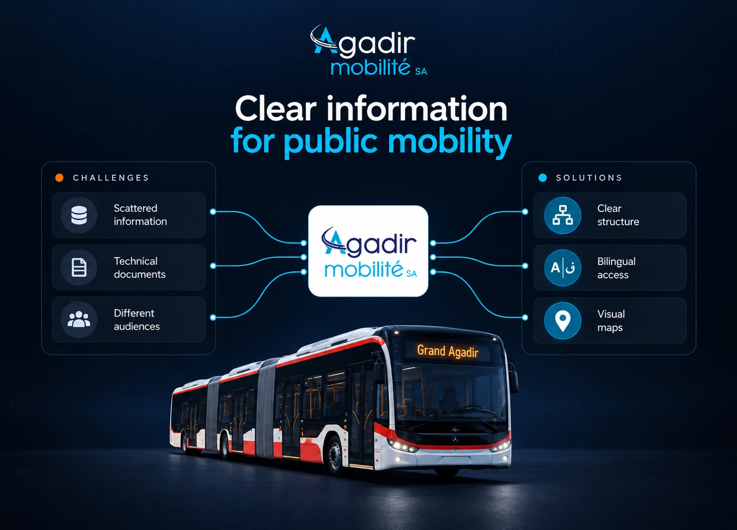
A corporate introduction, a transport project and a public notice serve different purposes. They need distinct entry points without making the website feel fragmented.
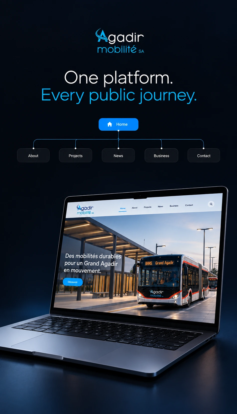
A concise homepage introduces the organization. Reusable sections then carry visitors into deeper pages, with consistent navigation, headings and calls to action.
The page structure moves from a clear introduction to more specific information. Three design priorities guide the presentation.
The opening combines Agadir imagery with a direct welcome, followed by an introduction to the company and its areas of action.
Project summaries create a first layer of information. Dedicated pages make room for descriptions, supporting imagery, maps and technical details.
Publications, institutional information and contact details belong within the same experience, with their own recognizable sections.
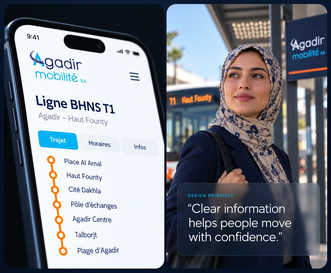
Public information.
Clear hierarchy.
One visual language.
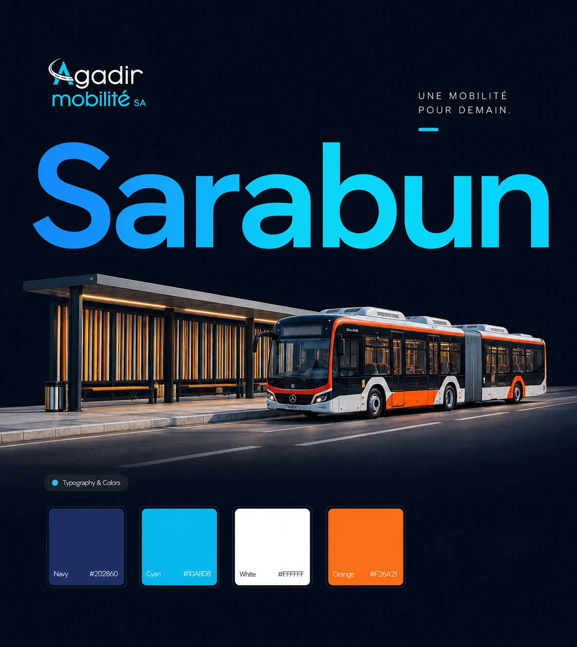
The supplied designs pair cyan and deep blue with white content areas and dark text. City photography anchors the website in Agadir, while recurring banners, section headings and buttons tie the pages together.
The presentation’s type specimen uses Sarabun across several weights and sizes. The hierarchy gives headlines, subheadings and longer passages distinct roles without introducing a different style for every page.
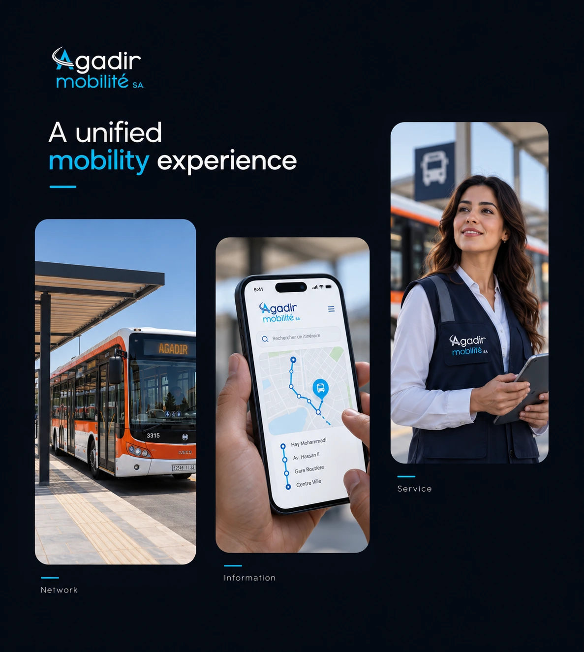
From the first impression to the detail pages, a consistent structure makes room for different kinds of information.
The homepage combines a city-led introduction, company context and areas of action. Further down, publications and contact information connect the broader story to practical next steps.

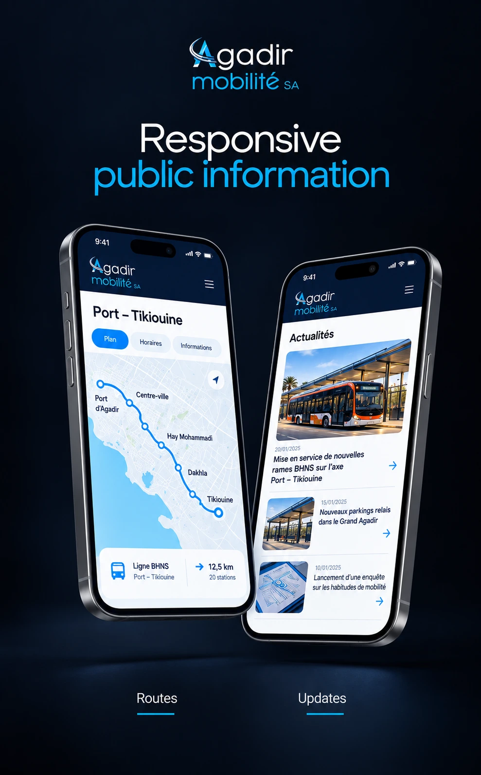
Route and news presentations show two different content needs: finding geographic information and following public updates. Shared navigation and section treatments keep both connected.
The publication and project-detail layouts give dense information its own space. Clear headings, supporting media and document areas help separate the main message from the detail.
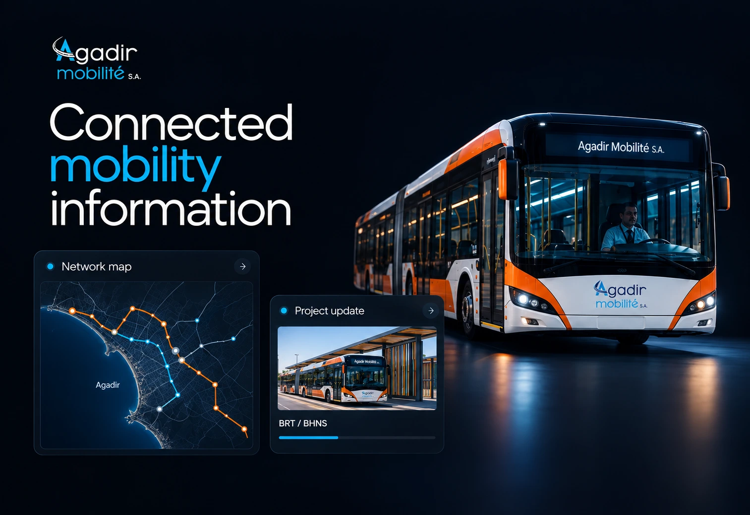
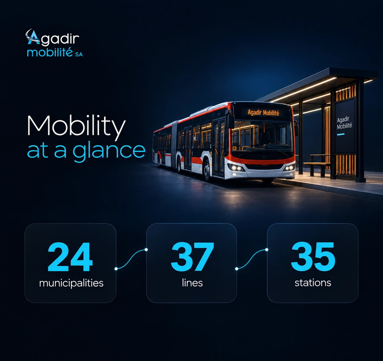
Network figures are reproduced from the supplied artwork; they are not measured outcomes of this design.
The mobile presentations bring routes, project updates and public information into a smaller canvas, with clear navigation and focused content.
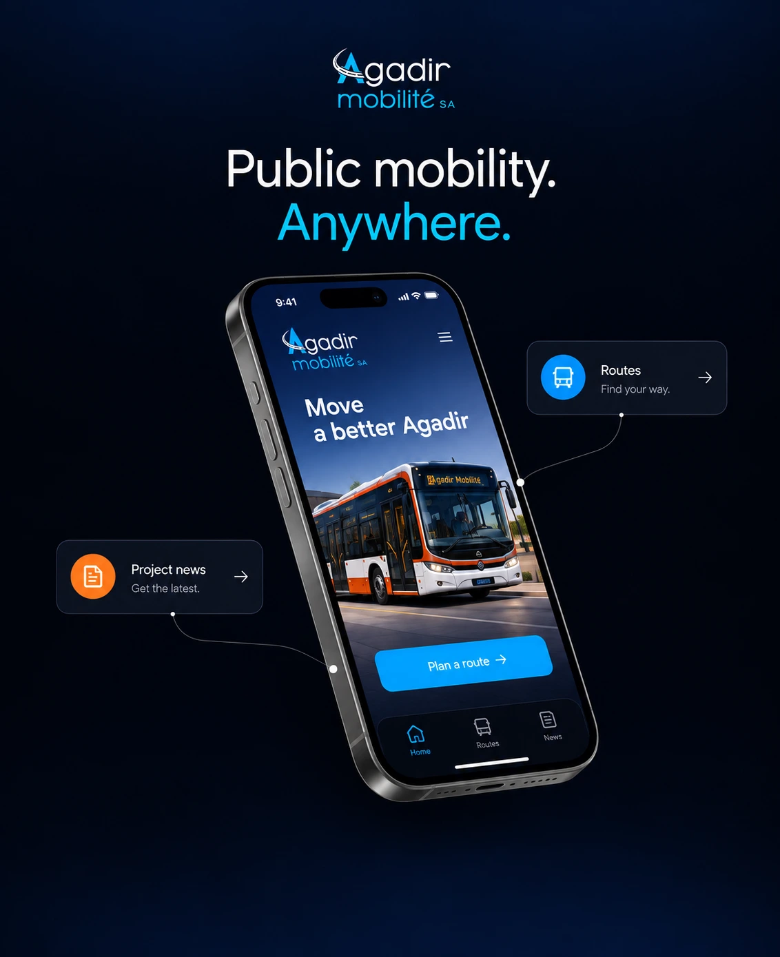

The presented work brings company information, mobility projects and public content into a consistent website language. Its strongest story is the relationship between content structure and visual consistency.
Large introductions and detailed content pages can belong to the same system. Repeated navigation, controlled colour and a clear type hierarchy provide continuity as the content changes.
A useful next evaluation would test navigation and content discovery with representative visitors, then review the mobile layouts and accessibility. This case study does not claim measured usability gains or business results.
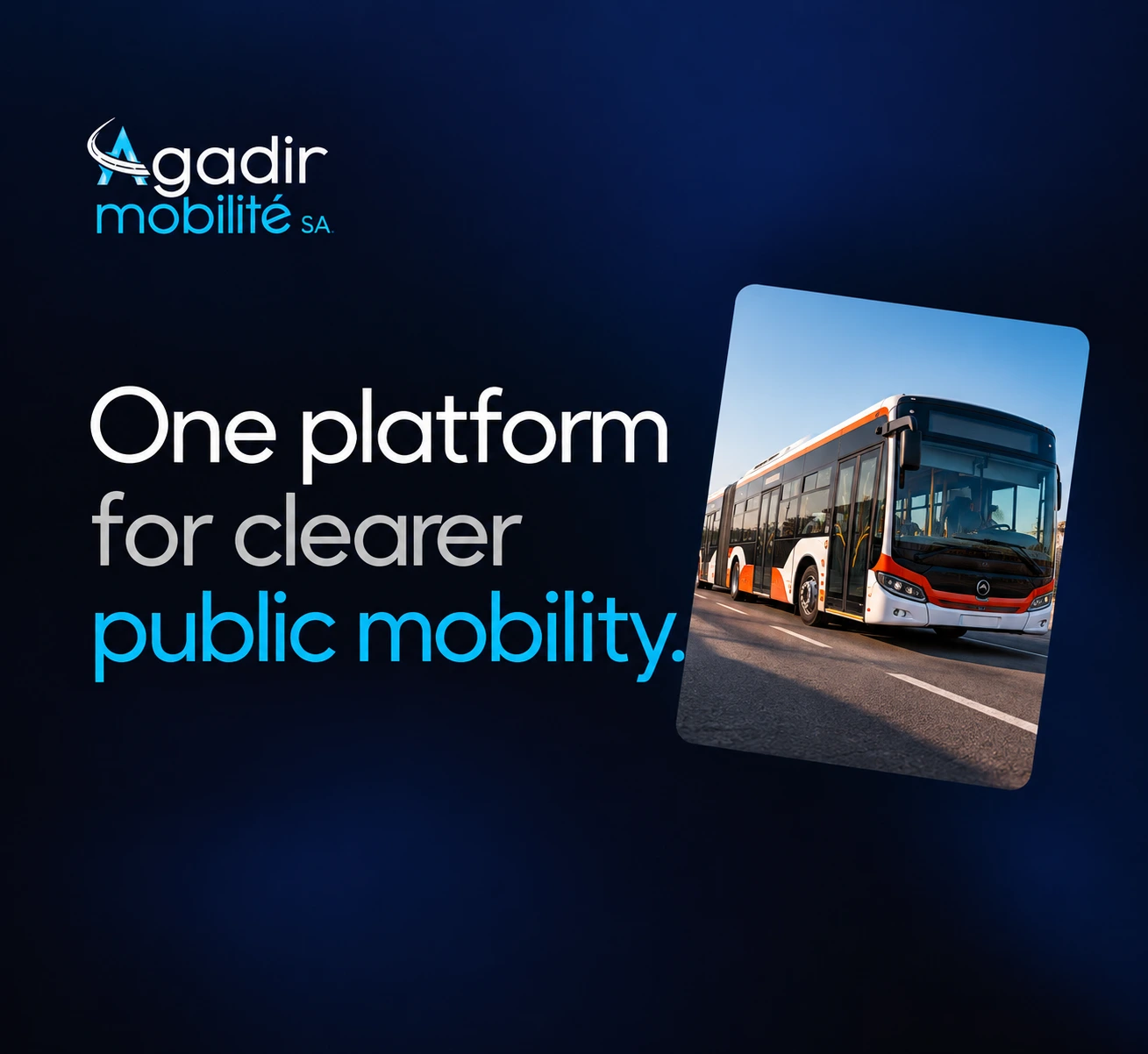

Images include presentation mockups and illustrative interface content. The live website may have evolved since these designs.